ePromo Tips
I get asked: Can you do some promo for me? Sure. Read no further. Go to my contact info. Redlight Records can take care of you. But if you want to try it your self, here's some tips.
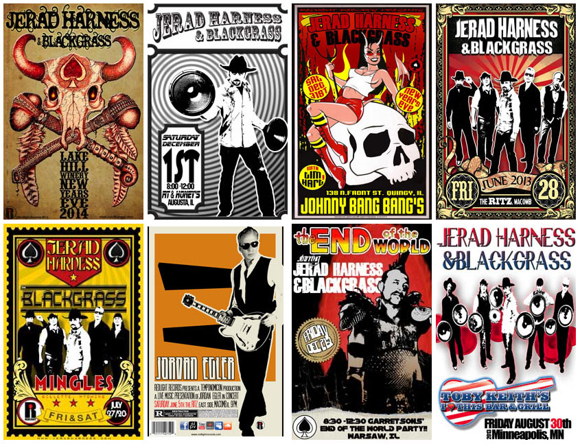
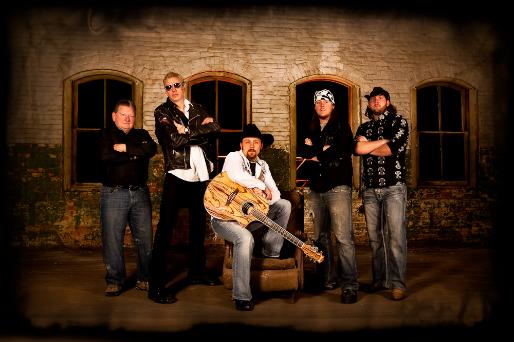
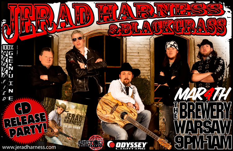
You can rarely go wrong with hiring a professional photographer. Hopefully someone you know and are friendly with. Let 'em know what you're after, and they can make you look good. Girlfriends with instamatic cameras rarely get good shots. You need a good camera, good lighting and a good background. The example below is basically a "brick wall shot", which is lame, but hey, there're easy. Taking group shots has its risks, as someone in the band at any one time is usually looking dorky, which can ruin take after take. Once you get a good shot, though, you can plaster logos all over it and turn it into posters and such.
Artificial Backgrounds. This is highly recommended for the solo artist. Chroma key backgrounds allow you to separate the subject from the background in Photoshop which then allows for all kinds of trickery.
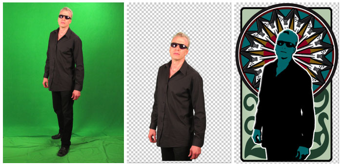
You can construct chroma key backgrounds cheaply with a bit of research and some elbow grease. The important thing is the lighting, and that does require some "real" equipment and a decent space in which to shoot. Greenscreen photography is a Redlight Records specialty.
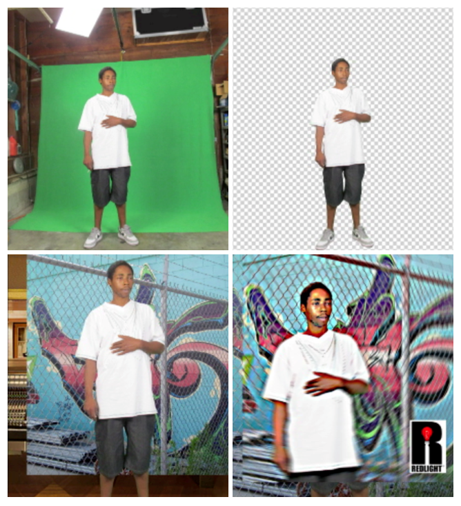
If you do your own pictures, pay attention to the image size and the bit depth (resolution). The image size is the physical dimensions of the picture e.g.6" x 8" or 512 pixles x 1012 pixles. The bit depth is how many pixles or dots per square inch e.g. 72dpi or 300dpi. Bigger is better. Even most cheap cameras let you switch from low quality, fast action, to high quality, slow action. For posed stills, go with the highest quality setting you have. Most cameras store images as .jpg or .jpeg format. They are both bit map image types which means that you can lose quility every time you modify it. Always keep copies of the original files so you can refer back to them if need be. Here's an extreme example of degradation of the resolution from re-sizing the image large to small and back again.
Pay attention to the light! If outdoors, always have the subject face the sun, even if its a cloudy day or you're in shade. Conversely, you can use the sun at the subjects back to make cool silohuette compositions. If indoors, watch for harsh shadows on faces. The flash function on most cameras is not particularly useful in professional photography. If there's not enough light to get away without the flash, you're better off not bothering. On stage, a flash will ruin any cool lighting effects. If you don't have any cool lighting effects, you're better off not bothering. Below are examples of bad lighting. *
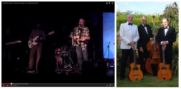
Stage Shots are very tricky; it's very tough to capture a group of moving people on stage without a good camera and operator. If you have that covered, you need to pay particular attention to the background as well as the subjects. Most gigs, and consequently, most stage shots are in shithole bars with poor lighting and horrific backdrops of beer signs, wood paneling, exposed electric cabling, exit signs, tv's, salad bars, etc. If you're lucky, have a good camera and operator, have a good stage background with good lighting, you can maybe get one good shot outta 25. You might be better off recording video and then scrolling through that frame by frame to zero in on some good still shots. The shot below was captured that way and would be good on posters and promo. And yes, I get accused of hogging the spotlight.
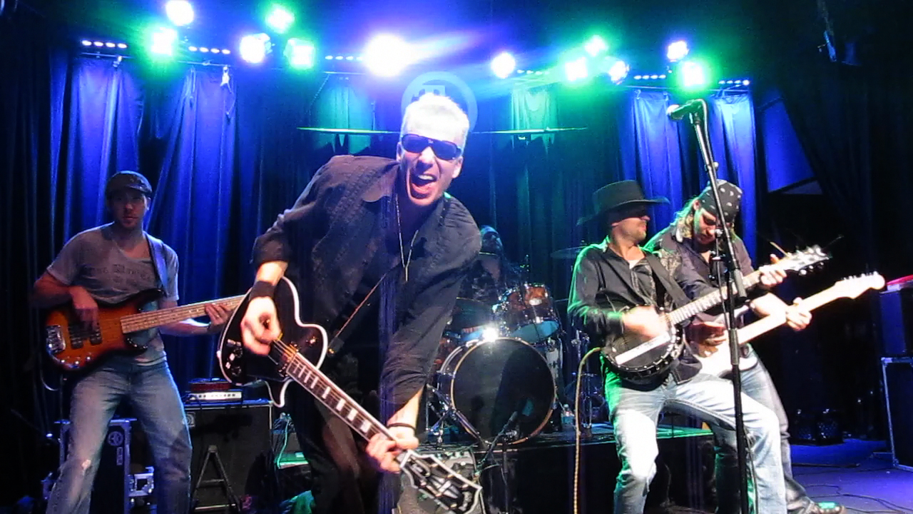
If you decide for video, you have to have an operator that's not afraid to get right in there and work the room, and move the camera around. Get zoom ins and outs on everybody and from both sides and in front of the stage, if possible. If you have an awesome crowd, get shots from behind the drummer. For the shot above, we had a camera operator in the security pit.
Not So Good. The shot below would not be a good shot to use for many reasons. Even if you cropped out the ceiling and the air conditioner, you still have beer signs, the drummer is outta sight, shitty lighting (camera flash), poor camera image quality, no-one is "posing" in any particularly dramatic way, mic stand in the way, and of course, the digital time-stamp.
Here are some more examples of poor choices for a promo package.
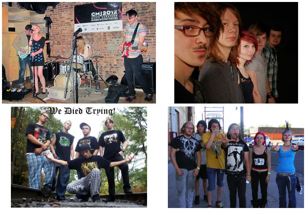
Here are some obviously cool shots. You want to be obviously cool, right? Don't leave anyone guessing about your cool-ness. As you see, a lot of images used on the web are in a 600x400 format. *
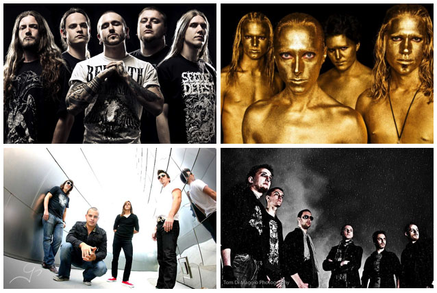
*Redlight Records makes no ownership claim to these images.
If you're doing graphics for the web, "standard" dimensions don't really apply, although a lot of bands use a 600x400 format. Square is often good with web graphics. In order to load quickly, web graphics are often reduced in resolution to 72dpi. A 300p x 300p 72dpi image is a good size for a "thumbnail" or facebook avatar. Images below are displayed at 190x190.

